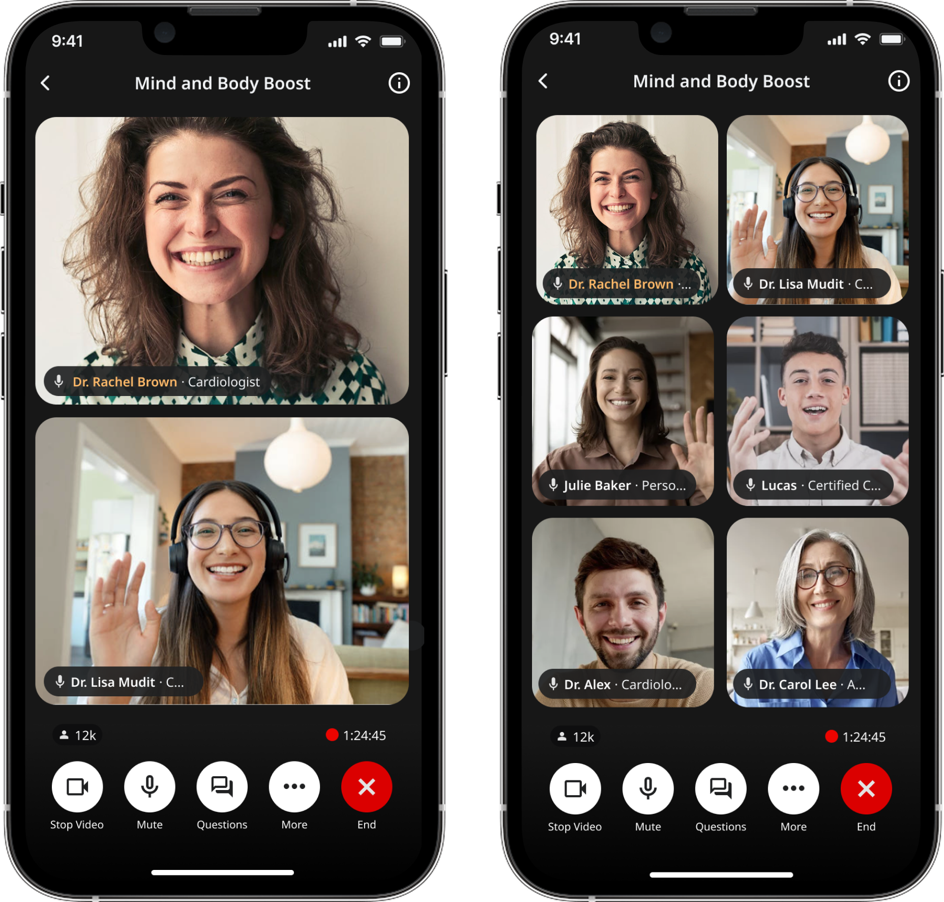
Multi-speaker GoodTalk Live UI
Multi‑speaker layout system for live sessions
Overview
Goodself is a consumer health platform designed to replace fragmented patient education and unreliable social media with structured, trustworthy experiences.
GoodTalk is Goodself’s live experience where health professionals host real‑time sessions. As GoodTalk evolved from one‑speaker talks into panel discussions, the UI needed to scale—without becoming confusing or visually noisy on a phone screen.
Role & Duration
I designed how hosts, speakers, and listeners experience a live session as it grows from 1 → 2 → 3 → 5+ participants, keeping the “who’s talking?” moment clear even when cameras are off. I partnered closely with PM + engineering to set rules, edge cases, and a shippable V1 that still felt flexible for different expert’s workflows.
Sept 2024 - April 2025
Design Goals
We only had a single-speaker view so we needed to add multi-speaker as a feature. Multi-speaker sessions introduced a new kind of complexity: the UI changes while the user is actively watching.
We need to solve for
Who is “on stage” when multiple people exist?
Where do new speakers go when they join?
How do we keep it readable on mobile?
How do listeners understand who’s speaking without confusion?
If the layout feels random, users lose trust.
Design principles: a layout system that stays calm under real-time change.
Keep the stage readable (even on smaller phones)
Make “who’s talking” obvious without relying on audio
Behave predictably when participants join/leave
Support camera-off states while still feeling “live”
Overall layout systemPlacement rules (deterministic):

To keep spatial memory intact, the system follows predictable placement:
Host stays prioritized (anchored so the user always knows where to look first)
New speaker joins in a consistent slot (teaches a repeatable mental model)
When someone joins, the UI prioritizes keeping the “main stage” stable
No one gets fully covered during transitions (movement without occlusion)
Layout changes are predictable, not shuffled (trust > novelty)
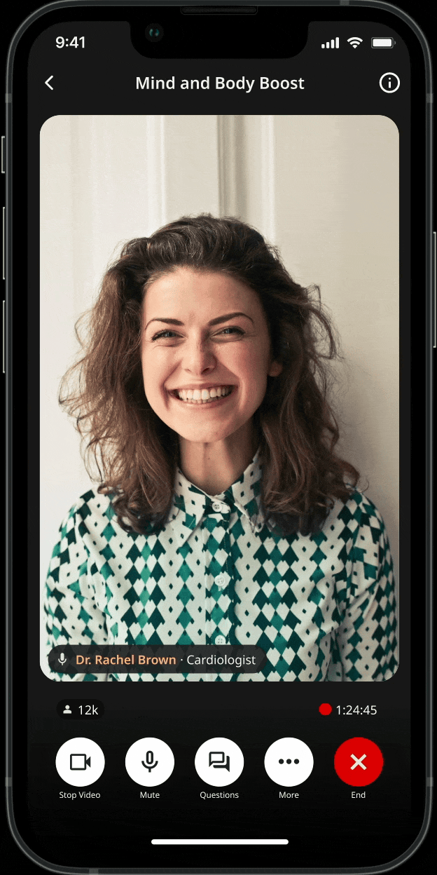
Pin speaker layout system
Pin Speaker Mode
Panel sessions often require focus—when one expert is explaining a concept or leading a segment. I designed a Pin Speaker mode that enlarges a selected speaker while preserving the presence of others.
The goal was to create emphasis without breaking spatial context or making the rest of the panel disappear.
Overall layout systemPlacement rules (deterministic): Applied
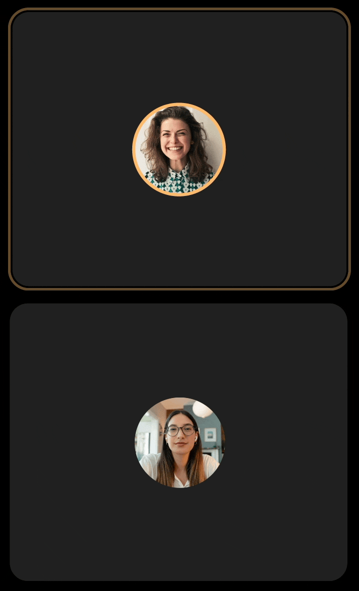
1 speaker→ single stage
2 speakers→ split layout
3–6 speakers→ grid layout
7+ speakers → maintain a clear stage + add a participant rail to preserve context
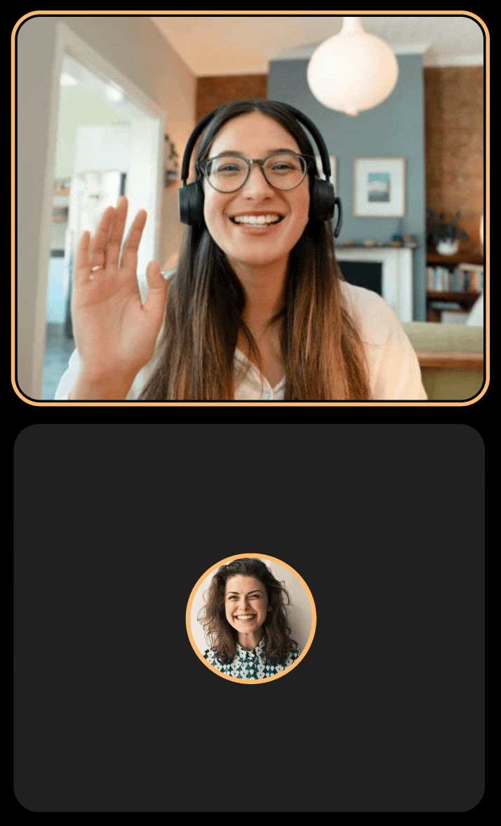
Making “Who’s Talking” ObviousIndicators for camera‑off reality
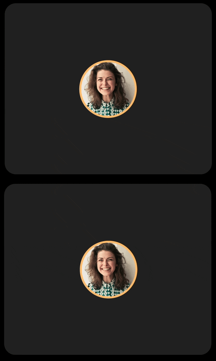
Many participants keep cameras off, which can make live sessions feel static and harder to follow. I explored audio‑responsive indicators to help listeners track the conversation while keeping the UI consistent across camera states.
Variant 1 — Audio rings
Mapped ring pulse intensity to audio level so the UI feels “alive” without video.
What didn’t work
It created a visual mismatch: camera‑off looked like a different product than camera‑on (border glow).
Variant 2 — Border + rings
Tried combining both cues.
What didn’t work
It added too much visual noise during fast back‑and‑forth conversation.
What we shipped: Border glow
A single consistent active‑speaker treatment across camera states so it feels alive without overwhelming the layout.
View Participants
Viewing participants and permissions
Live sessions have different roles with different responsibilities. I designed a Participants view that groups people into Host, Speakers, and Listeners, and shows controls based on permissions so moderation tools are available to the right people without cluttering the listener experience.
Host: manage session + moderation (ex: Mute all)
Speakers: present on stage (camera/mic controls)
Listeners: view/engage without stage controls
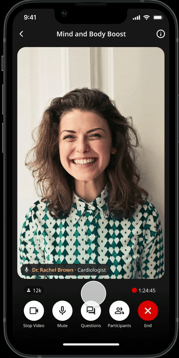
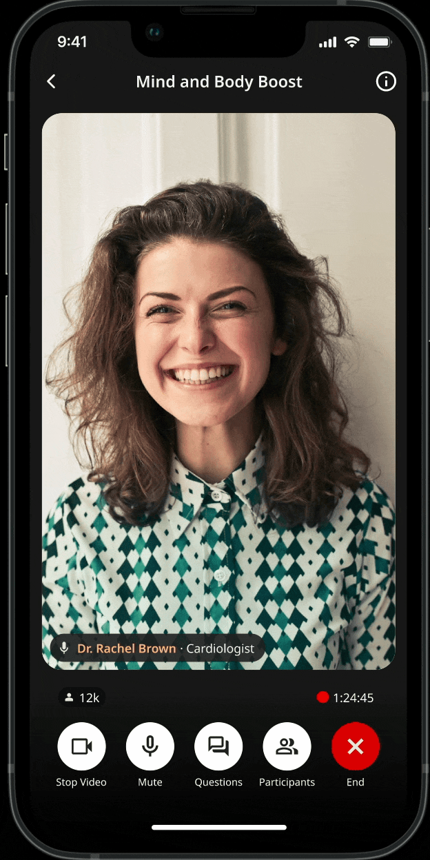
Tap-to-hide UI behavior On mobile, live sessions compete with chrome (controls, labels, navigation). I introduced a tap-to-hide UI behavior so viewers can temporarily remove controls and give the speaker more space then bring controls back instantly when needed.
Key design intent:
Prioritize the speaker when the user is “just watching”
Keep critical actions one gesture away (tap brings controls back)
Creating more real estate
Enabled multi‑speaker sessions in production
Reduced confusion during join/leave moments (qualitative feedback)
Improved host confidence during setup + moderation
Seeing Results
Designing for live multispeaker view taught me that users trust layouts that behave consistently more than ones that constantly “optimize.” Live UX works best when roles are clear, and camera‑off participation is treated as first‑class.