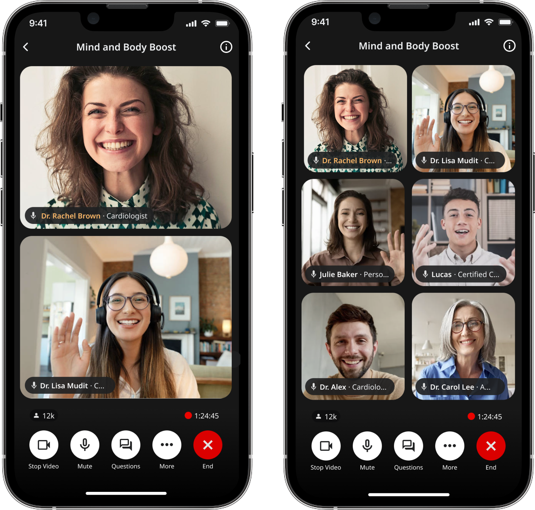
Multi-speaker Live UI
Multi-speaker layout system for live sessions.
Overview
Goodself is a consumer health app replacing fragmented patient education with expert-led content.
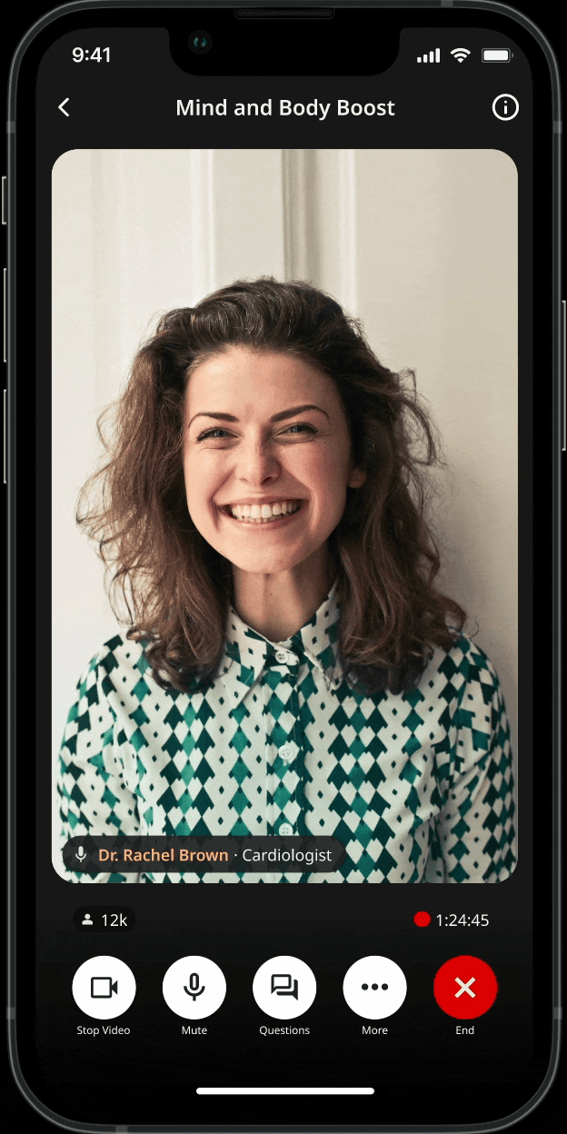
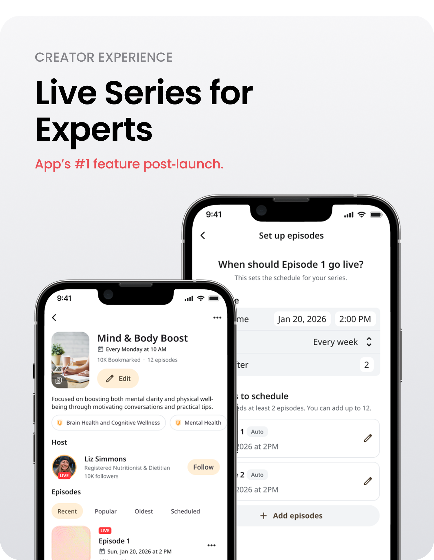
GoodTalk is a feature where health experts go live. It started as one‑speaker but evolved into panel discussions.
Role & Duration
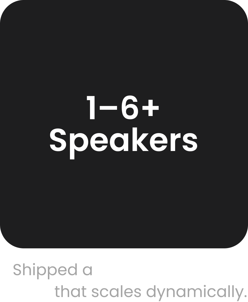
Designed how hosts, speakers and listeners experience a live session as it scales from 1 → 2 → 3 → 6+ participants.
Shipped, Sept 2024 – Apr 2025
Design goals
The challenges
Who is “on stage”?
Where does a new speaker go?
Who’s speaking, even with camera‑off tiles?
Introducing a multi-speaker UI meant solving for layout shifts while users are actively watching
Design principles
Keep the stage readable
“Who’s talking” is obvious without relying on audio
Behave predictably during join/leave moments
Treat camera‑off as first‑class
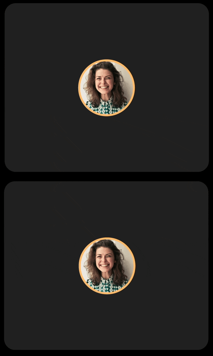
OVERALL LAYOUT SYSTEM
Placement rules (deterministic):

To keep spatial memory intact, the system follows predictable placement rules:
Host stays anchored.
New speakers enter a consistent slot.
Join/leave logic prioritizes the existing stage.
Designed to avoid overlapping faces.
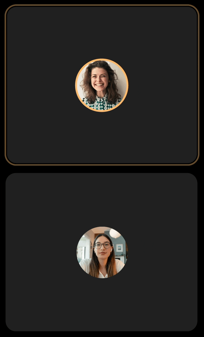
E2E LAYOUT SYSTEM
Placement rules (deterministic): Applied
1 speaker → single stage
2 speakers → split layout
3–6 speakers → grid layout
7+ speakers → clear stage + participant rail
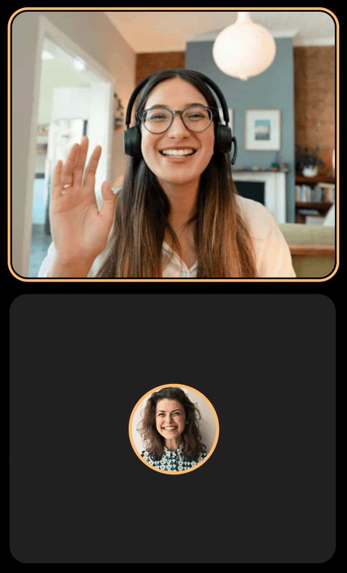
PIN LAYOUT SYSTEM
Pin speaker mode
To enlarge one participant while keeping the rest of the panel visible.
The goal was to provide emphasis without breaking the spatial context or making other speakers disappear.
MAKING ‘WHO’S TALKING’ OBVIOUS
Indicators for camera‑off reality
When participants keep cameras off, panels can feel static and hard to follow.
Variant 1 — Audio rings
Pulses based on volume.
Variant 2 — Border & rings
Tried combining both cues.
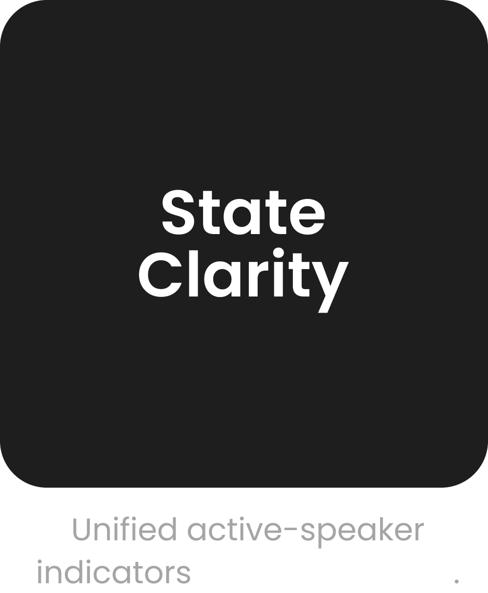
Shipped — Border glow
One consistent active‑speaker treatment across camera‑on/off.
PERMISSIONS-BASED VIEW
Contextual participant views
Live sessions involve distinct responsibilities. I designed a participant view that groups users by role, ensuring moderation tools are only visible to those who need them.
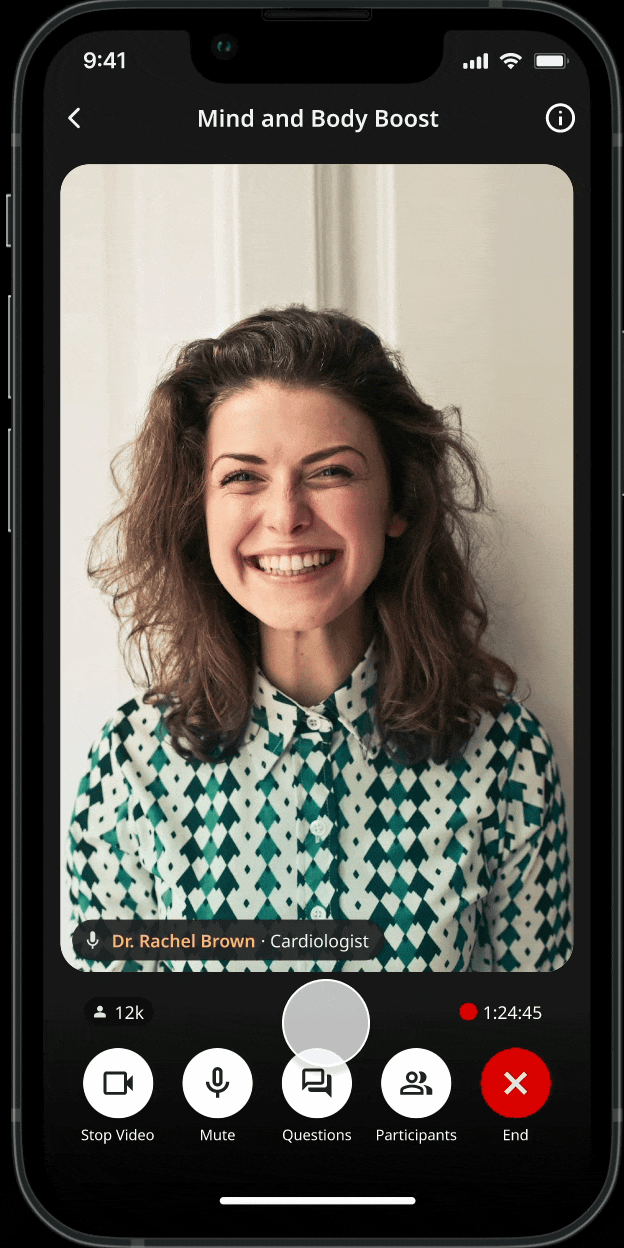
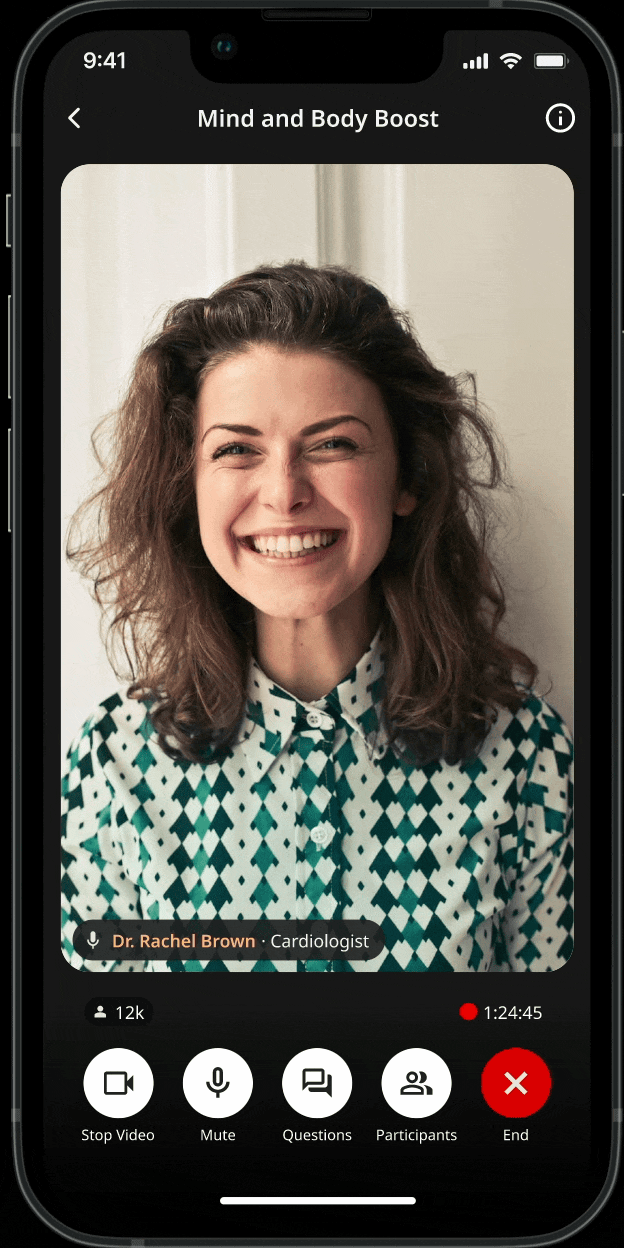
On mobile, the stage often competes with UI chrome. I introduced a tap-to-hide behavior so viewers can focus entirely on the content then bring controls back with a single gesture.
Intent: Prioritize the stage when the user is just watching.
Access: Keep critical actions exactly one tap away.
Creating more real estate
TAP-TO-HIDE UI BEHAVIOR
Seeing results

In live multi-speaker UX, stability beats optimization, and consistency builds the trust users need to engage.
By being explicit with roles and treating camera-off states as a priority, the platform stops feeling like just another video call and starts feeling like a shared live event.
Reflection
More projects